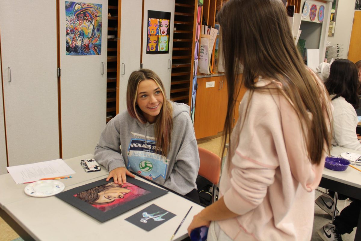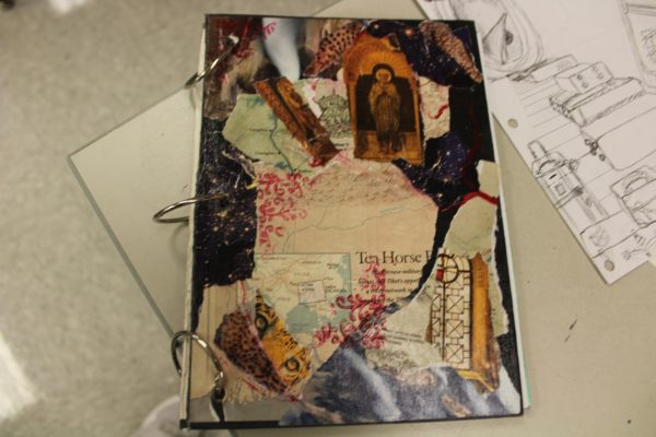
As Lizzy Heitchue, junior, makes her way into F204, she lays her bag down and gets her required materials from the art closet to get what she needs for the day. Then, Mrs. Page demonstrates what they are doing or if it’s a work day, they get to work and continue creating for their project. So far, they have completed four projects and more are to come. The first assignment was the covers which were personal representations of themselves. They could just do whatever they felt represented their style of art on your cover. Lizzy’s is more abstract. She has lots of different pieces on it. She incorporated many night pieces. There’s also a fair amount of animals on there. It has more of a mysterious overall view. It was a collage piece. It was only one medium, so they could use any kind of paper to put their pictures, newspaper, or old books Mrs. Page had at the end, they used a Varnish and it’s all just a collage.
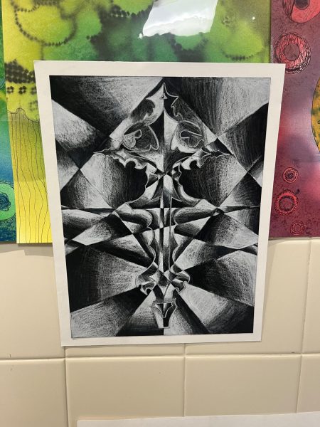
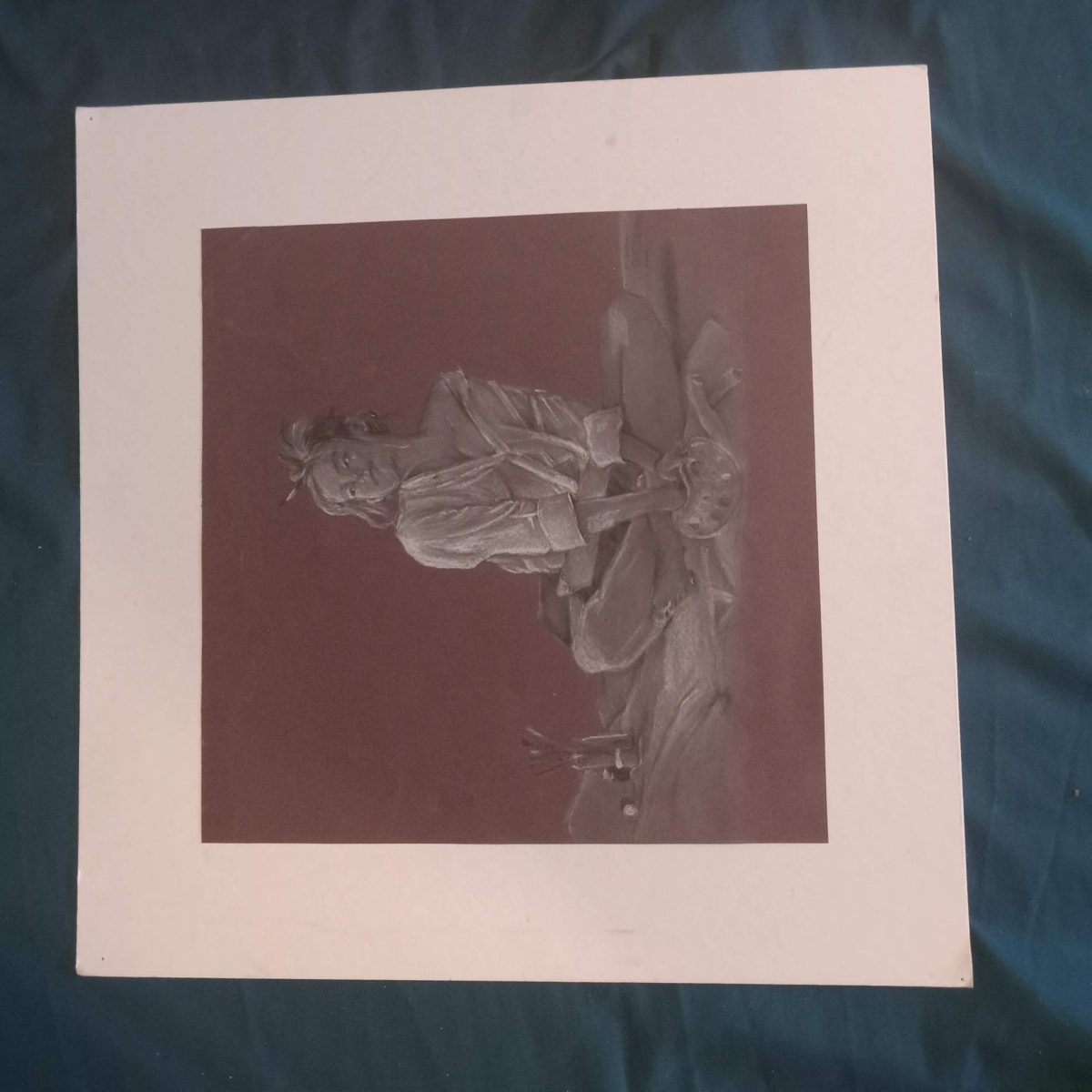
Next, the purpose of the next project was to highlight an image with contrasting colors, but there isn’t any color in it. It had more contrasting values. So, black is the darkest, and white is the lightest. So they were to pick a figure. The project is called Shatter Image because they, in a way, shatter it by drawing abstract lines. They could draw lines all originating from one corner or more squiggly lines, just so that the drawing is divided, and then within different sections, they’d have opposite contrast, so it’s almost like if you were to break a piece of glass, how like it captures the light and looks shattered, that’s what the drawing is. So, the more lines they drew, the harder it was to see the original contour drawing that they did. The point of this project is for them to still see it in the portrait and it’s almost harder to find just because of the way it’s colored.
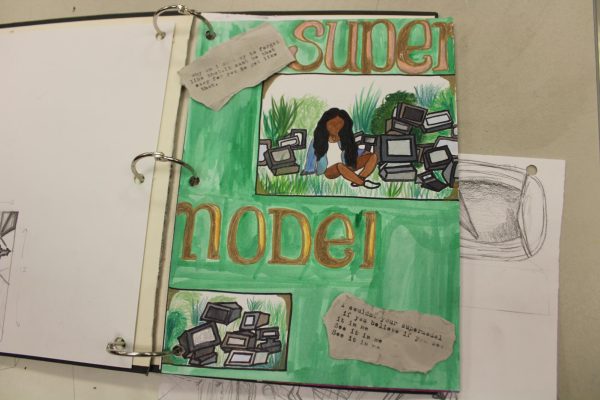
After that, the next project was a sketchbook assignment that was to take a song that was symbolic to them and put it into a drawing. It wasn’t just drawing the album cover, but using what that song means to you and creating an image out of it. It didn’t have to be exactly what the song was saying. It could be the mood and how it was displayed, or just how it made them feel, the mood of the song.
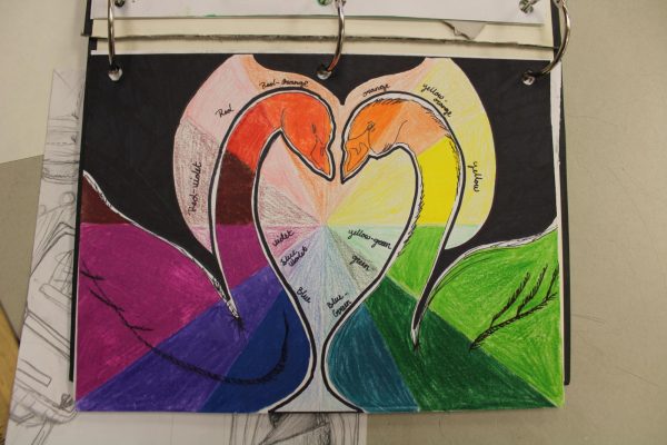
The following project was another sketchbook assignment. It was based on the basic color wheel, all 12 colors, the primary, tertiary, and secondary colors. They had to draw, or color in the wheel in a unique way, so not just the ordinary circle, but a different shape or an interesting design that wasn’t just the basic circle that everyone’s used to seeing.
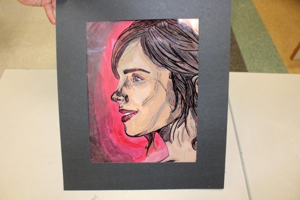
Although it looks complex, this was a more simple assignment. The point of it was to focus more on contrasting colors and what in the painting draws the viewer’s eye to it. So, they were allowed to use different patterns on the color wheel, contrasting colors, and other patterns on the color row. Most people used contrasting colors and translucent plastic paper to be able to trace over a celebrity or any person they desired. Whoever they chose, then got traced to get the contour lines and then, it was a personal choice if they wanted to paint the person with a natural skin tone, or if they wanted to use contrasting colors. After they were done painting the person, they painted the background to go with their already-decided design. So, for example, if the person had blue detailing, the background would be orange, to make it contrasting. Then they had to matte their work, which they had to complete with all of their final projects, and it’s based on what colors are used in the project to make all the color palettes.
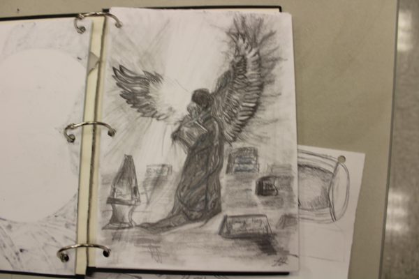
Continuing, their third sketchbook assignment was about how cemeteries are scary to you, or what drives people away from them. This project was more of a broad concept because a lot of people can interpret it differently. To elaborate, it didn’t have to be very tangible, there were lots of people who drew their sketches with ghosts or spirits because it is a common reason why people are scared of cemeteries. This is to demonstrate what scares people about cemeteries, what reminds you of cemeteries, and what drives people out of them.
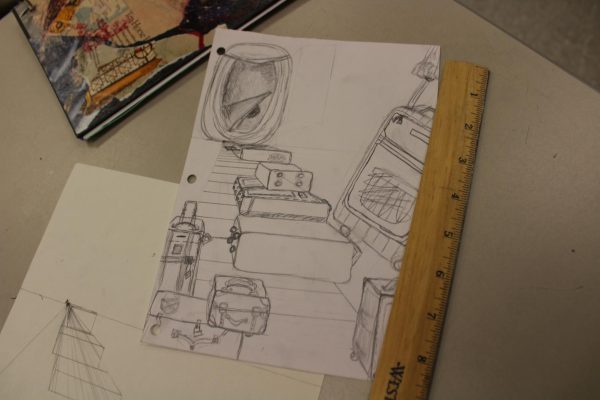
Lastly, the current project is raising a one-point perspective and incorporating a staircase because it’s one of the basic things to draw with one one-point perspective. This shows how it connects to the vanishing point. So, the staircase doesn’t have to necessarily be a staircase, but it could be something with the same structure. So in Lizzy’s drawing, she did a stack of suitcases. Anything that resembles a staircase can be used, so they can use shading and different values to demonstrate how vanishing points and one-point perspectives are related.


